Thursday, 26 November 2009

Chocolate business card...

I'm aware that I need to create my own business card soon so with that in mind I was looking at unusual and inventive cards on the internet and I came across this...

It's made entirely from chocolate in an attempt to make people remember the company. As inventive as this is I'm a bit sceptical about wether you would remember the name of the company once you'd eaten it!

Blank manual...

Ok, I'll try to stop posting about direct mailers but they're more inventive and interesting than I thought! This one for Vodafone was a instruction manual for their new wireless service. The manual however was completely empty, showing how simple and easy it is to use their new service. Such a simple way of conveying how easy it would be to use this service...

Paper burglar...

I wish I had seen this when we were doing the police brief...


What a great way to convey a very important and serious message in a humorous and inventive way. As you can see inside the envelope a piece of paper unfolds to create a life size burglar along with the text, "it's that easy to get in your home." Its quite frightening and yet amusing at the same time!

RIP Rats...

Who knew that pest control companies were so inventive! In contrast to my last post this pest control company went away from the humorous approach to produce this direct mailer...


They sent out tiny little coffins in the post which undoubtably would grab people's attention instantly and it is directly related to the service on sale.

'Rats Health' magazine...

I was researching direct mail campaigns for the new alcohol awareness project and I came accross this...
It has to be one of the most bizarre direct mailers I've ever seen and I couldn't work out what it was. It simply featured a number of miniature magazines which would certainly confuse and intrigue the recipient. After carefully looking at it and reading up on it I discovered that this was to advertise an extermination company. It just makes you think that someone must have really considered this mailer and come up with an original idea rather than sending some frightening information on rats!

28 days to go...

It's 28 days to go until Christmas and with that in mind I was looking at unusual Christmas cards and I found this one designed by VW. I really wish I'd thought of this! I think its a really clever way to send out something corporate that you'd actually want to keep. I can't believe how simple it is!

Monday, 23 November 2009

Intellident...

Last week I was fortunate enough to spend a week's work experience at Intellident, a company which specialises in RFID electronic tagging. This technology has led to them being involved in all different areas of retail. To be honest, I did not really know what to expect from this placement, with it being a company that is not specifically design based. However when I began working there I realised how vital it is to their industry.I was set a number of different briefs throughout the week, all of which I thoroughly enjoyed. They involved a wide range of different formats and forced me to adapt to many different ways of working.
To begin with I was asked to design a logo for their new product, the
smartBlade. I was given a range of brochures in order to give me some information on the product and then i got designing....

The company already had a very specific visual identity and so I wanted to stick to this style, but at the same time show elements of the product in the logo. The key element of the product that stood out to me was its flashing light and I really wanted to convey this in the design. After a lot of consideration, myself and a few members of staff chose this logo...


I was pleased with the final logo and I have since heard that it is now being used to promote the product.

My second project was using flash, a program which although I enjoy using, I have only had a small amount of experience using it in the past. The company wanted a Christmas E-Card that they could send out to their clients via email so it had to be a short animation that would not be a huge file size. I came up with 4 animations in total but sadly blogspot is upsetting me and not letting me upload them so I'm afraid you'll just have to take my word for it!

Thirdly I was asked to look at some rough designs for a new machine that they will soon be putting into production. I was told that in the future, libraries will dispense E-Books and iPods with the reading material already loaded onto them rather than lending you the book itself. Therefore Intellident have designed a machine that will do this for them. These new consoles will then attach onto their already existing machines. I was asked to look at the designs for it so far and mock up the image on Photoshop to look realistic.
I haven't really done anything like this before so I wasn't entirely sure what it would end up looking like but I have to say I was quite pleased with what I came up with! I did this on the first day quite quickly and I was told the next day that it was already being used in presentations which I was very happy about.

After having designed the smartBlade logo, I was asked if I would design a simple website consisting of only one page which would have a small amount of text and a video about the product. After experimenting with many different layouts I finally came up with this design...
I found this to be a difficult brief with it only being one page and with it containing very little content. However I have since been informed t
hat the web design team are creating it and it should be linked from their website very soon.

And finally! When Intellident send out information on their products they use data sheets consisting of an image of the product and all the technical information on it. As they are currently trying to expand their client base to schools I was asked to design a data sheet that would look much less intimidating to read and would be appealing to a school. I came up with this...
I decided to go for the 'school notice board' look as I thought it would be a layout that teachers could relate to and would catch their eye. I was told that they will soon be using this design to send out to primary schools in an attempt to increase their client base.

As you can probably tell I really enjoyed my time spent here. I was only there a week and yet I feel I got so much done and gained some really valuable experience about the working environment. Before hand I thought I was pretty good at using the Adobe creative suite software but due to all the experimenting I did with my work I learnt so many new techniques and features I didn't even know about before!
When I left they asked me if I would be interested in doing some work for them in the future if they emailed me when they needed things doing so hopefully this will lead on to many more opportunities in the future. I was so glad that they asked me to keep in touch as I found my week spent there really valuable and I hope that they were happy with what I produced.

Wednesday, 28 October 2009

Think! Campaign...


I saw this in the paper the other day and it really caught my eye..(no pun intended!) I loved the striking images used in the posters and I think it goes well with the current TV advert. It's one of those things you see and really wish you had designed yourself. I didn't realise until I read the accompanying article that they have won a D&AD award.
The designers, Alex Beck and Will Hudson said that their inspiration came from a set of 'eyescapes' by Rankin which showed all the intricate flaws. They researched the effects of drug driving and they found out that different drugs have different effects on the eyes which lead to their series of images all with the same format. I found these posters really inspiring. They intrigue the viewer and make them want to make sense of what they are seeing rather than using obvious and graphic imagery that Think! campaigns usually use. The article confirms what I have been writing about in my dissertation and I am sure that I will reference this in it.

This man...

I saw this bizarre story in the Metro this morning and it really intrigued me. At first I thought it was the usual strane article that seems to appear in the Metro every now and again but then it became a bit more interesting.
Its claimed that this man has been seen by thousands of people in their dreams in many different situations but nobody knows who he is. It says that the story began in a psychiatrists office in New York
in 2006 when a patient drew this man and said that he was appearing in recurring dreams. According to the website thisman.org, other patients from around the world drew the same face and all referred to him as "this man."There is a youtube video dedicated to this man as well.
However it says that the site thisman.org was registered by Andrea Natella, a founder of Italian guerilla advertising agency who is known for campaigns such as 'Shock and Hoax' which leads people to believe that this is an ellaborate marketing strategy. Yet there is still no indication as to what they are promoting. I really hope this is an ellaborate advertising technique and I wish I had come up with it! I will definately be researching this story again to see what it is really about...

If...

"Which side would you be on?"

I must admit, it took me a while to get into this film and fully understand what was going on but once I did i thought it was brilli
ant. When it was released it was seen as being very controversial as it was dealing with the British class system which was particularly important in this generation. It was very bold at the time and dealt with issues like opression and individual freedom. It showed the private school system in a very realistic way which people at the time did not like to see. Throughout the film you were able to see how the main characters were constantly belittled and sometimes abused, focring them to resent the private school system that they were apart of.
The film was divided up into chapters which I really liked, it divided up all the factors which lead to the characters hatred of the class system almost into a list. It made it much easier to empathise with the characters and understand their feelings towards the people around them.
The majority of the film shows how much they want to fight back but they are always beaten down again. Therefore he ending of t
his film really shocked me, it was not what I was expecting! It shows the rebelling students on a roof top opening fire on the staff and other students. As the headmaster steps forward saying "trust me" he gets shot in the head. They finally have made themselves a situation where their roles have been reversed and they are in control of their own lives, as well as everyone elses.
As I said earlier, the end scene of this film was not what I was expecting at all and I think I need to watch it again to fully appreciate it and understand the dismay of the main characters.

Tuesday, 27 October 2009

Le scaphandre et le papillon...

Le Scaphandre et le Papillon - The Diving Bell and the Butterfly.


This is undoubtably one of the most moving films I have ever seen. From the second it begins the distorted imagery and the unusual view point intrigues you and drags you in. The film is based on a true story about the ex editor of French 'Elle' magazine Jean-Dominique Bauby who at the age of 43 suffers with a rare condition which paralyses his entire body apart from his left eye. Not only is the entire film created as if you are looking through his eyes, but it also enables you to hear his thoughts that he cannot express to the people around him which really made you empathise with the character. You an really feel his frustration as he tries to express his feelings and emotions with the people around him. You can also feel his pain as suspension grows as he struggles to see what he now looks like, it isn't until about half an hour in that he glimpses his face in a reflection and doesn't recognise himself. Whilst suffering from this terrible condition, Bauby learns how to communicate using just his left eye. This system leads to him composing a book about his struggle as he painstakingly communicates each letter blink by blink.
Throughout the film there is a constant feeling of hope, not as much with Bauby himself but with the people around him. You are constantly being reminded that he is making progress and is gaining some control oh his body.
Towards the end of the film you begin to understand what he was like before the stroke as you see a mixture of memories and dreams which depict his relationship with the people around him.
The films ends simply by telling us that Bauby died only two days after his book was published. This is a huge shock to the viewer who has been told all the way through that he is making remarkable progress and the implication is that one day he will recover.

Johnny Hardstaff...


I recently attended a lecture by the director and designer Johnny Hardstaff. He showed us many examples of short films he created in order to promote famous brands such as Sony, Playstation and Orange. The first film he showed us was entitled 'The history of gaming' which interested me instantly as I had recently attended the 'Videogame Nation' exhibiton at the Urbis so I recongised many of the images used. I loved the retro feel to the film and I felt that it really stood out from other moving image pieces I have seen to advertise games consoles. I was suprised that Sony wanted to use it to promote the Playstation 2 as I have researched many ads for that product and they all seemed to take a completely different approach to the imagery used.


He then went on to create another moving image piece entitled 'The future of gaming,' to be completely honest I wasn't as taken by this film, I found some elements of it almost disturbing to watch. However when he explained it afterwards I realised that that was the effect he was trying to get. It was in huge contrast to the first one. It portrayed the video game industry in a very negative way in a very different style to the previous video.

I was suprised when he showed us the Orange advert as I am very familiar with this but I never realised that it was Hardstaff who designed it. The images of the paint pouring onto the street were mesmorising and you couldn't help but stare at them. It was very different to his other videos but it was just as interesting. I love how simple it is and yet it grabs your attention as well informs the viewer about the service on sale.


I found this lecture really helpful. Not just because of the inspiring visual examples that he showed us, but he also told us of controversial advertising campaigns which I have since researched in preparation for my dissertation. I really liked how much of his thoughts and personality he put into his work and it really inspired me to do the same with my own work.

Tuesday, 20 October 2009

Sound and Vision...

"An exhibition of previously unseen pictures recording the many different fashion scenes in Liverpool clubland."


I recently went to see a collection of photographs by Francesco Mellina at the Liverpool Conservation Centre. The photographs featured a range of images showing numerous local fashion styles between 1978-82 as well as some of the most iconic bands of the period.I found these photos really interesting as they showed a huge contrast between fashion then and now. In the aftermath of the punk movement, people were keen to show their personality and their individuality by the clothes that they wore, before famous brands took over the high street. Although the images were in black and white, you could really see the personality and attitude that this fashion conveyed.

Joey Ramone, The Ramones, 1977.

Clubbers, 1981.


Friday, 16 October 2009

Cecil Beaton...


Before I visited the work of the photographer Cecil Beaton at the Walker Art Gallery I had a pre-conceived idea of what it would be like... I imagined that there would be huge images of some of the most famous people of the 20th century.
I was slightly suprised when I got there. Although all the images I'd thought would be there were on display, there was only one that had been enlarged, the famous photograph of Audrey Hepburn. The rest were only small and in glass frames which was quite irritating due to all the lights bouncing off them! However it did
not take much away from the iconic photographs. He is of course renowned for his fascination with Hollywood stars and that was clear to see from the exhibition. There were beautiful photographs of Marilyn Monroe, Audrey Hepburn and Julie Andrews which captured their more private and vulnerable side.


The images that I was most interested in were the ones of the Queen and Prince Charles. The images that I am used to seeing of them are all very uniformed and serious, in contrast these images really showed their personalities and again their vulnerability and just made them look like a normal family having fun.

Although I was at first slightly disappointed by the exhibition I had changed
my mind by the time I'd left. I decided that maybe the scale of the images was the key to preserving the sensitivity of them. Even though the images spanned six decades, the photographs appeared to be timeless which must be why they are still so popular today.

Sunday, 11 October 2009

Melvin Galapon...


I was researching for inspiration for the 'Silence' project and I came across this image made by Melvin Galapon, an illustrator who's work I have not really seen much of before.
At first glance I thought it was made up of blocks of colour as I've seen some similar images made in this way. However I was suprised to see it is made up of letters, numbers and symbols. I would love to able to create something using this technique although I doubt I could! I might have a go if I'm feeling clever...

Stephen Shakeshaft - Liverpool People...


Last week I went to the see the work of photographer Stephen Shakeshaft which is currently being displayed at the National Conservation Centre Liverpool. It showed 70 of his photographs since the 1960's including award-winning images alongside unpublished ones. They featured a range of local personalities as well as major stars in their everyday surroundings. Shakeshaft, the former picture editor for local Liverpool papers, is renowned for his spur of the moment images which seem to capture a world which is similar and yet different to our own.


"It is a case of looking left and looking right and not just straight ahead. As a press photographer I like to be at the back waiting for the moment because you only get one chance to go for your picture and get back to meet the edition deadline."


All of his images feature people from all corners of society around the region going about their daily lives. The thing that struck me about his images the most was the sadness that it would be almost impossible to capture images like this today. Nobody would be able to get away with photographing unknown children playing innocently in the street without getting in trouble!

"Much of my work involved sport and news stories but there were often quieter periods when I might see an everyday scene making a great picture. The passing years have added to the atmosphere of these images."

There are eye opening stories mixed in with everyday scenes. From happy children playing in the city centre fountain, to images of people being evacuated from their homes, the images capture evocative stories from the past few decades and show great social change.


I really enjoyed looking at these images. It isn't very often that you can see a photograph and feel that you really understand the people's emotions and know the story that is unfolding around them. I loved the mix of humorous pictures woven in with life changing moments in the lives of the people they featured.

"We call them photographs but they are also history; telling of men, women and children and their part in passing events. Once the button on the camera has been pushed those people are given a kind of immortality, for the camera is a third eye adding permanence to the sight it sees."


Thursday, 8 October 2009

Ubangi Timber...


One of my relatives works for an international timber importing company which I recently decided to research and I was amazed to discover that they had no logo and no corporate identity! Therefore, I put together a few ideas of logo designs which I tried to keep as simple as possible and I chose one which I thought would be most suitable.
I took a chance and e-mailed the logo to the head of the company and I have just had a response saying that they loved it and would love to use it! They have also said that they would be interested in me creating some work for them again in the future so I'll add some more stuff as I do it.


Videogame nation...


The Johnny Hardstaff lecture earlier this week reminded me of the 'Videogame Nation' exhibition I visited during the summer. The illustrations on the posters instantly caught my eye...


The mix of pixelated images and hand drawn elements collaged together really interested me.
The exhibition was even better. I assumed it would just show retro games and artwork used to promote them. However, it showed the meteoric rise in gaming over the past 30 years. It was a huge contrast to see the simplistic pixelated graphics as seen in very early video games compared with ones today.

It showed how the consoles themselves have changed and been developed, it was interesting to see how different they are today. There were a range of retro posters and advertisements which show how differently games are marketed today.

The exhibition also showed the darker side of gaming. The increase in violent video games which never fail to cause controversy. There were also newspaper articles and medical reports describing the psychological affect of games and how people can become addicted to them and lose focus of the divide between reality and fiction.

I absolutely loved this exhibition. I love exhibitions which are interactive and you can get involved with and I look forward to similar exhibitions in the future.


Bridget Riley Flashback....


I recently visited the Bridget Riley exhibition currently being displayed at the Walker Art Gallery Liverpool.
To be completely honest I had a pre-conceived idea of what I thought it was going to be like but I was pleasantly suprised by the exhibition. I have admired her work in the past but due to the use of simplistic forms and colours and I naively assumed they were relatively easy to create. The exhibition showed me how wrong I was!
Not only did the exhibition show the finished images, but it also displayed the plans and sketches for some of her most famous pieces.


I was suprised to see that each element in her images were carefully measured and placed at specific angles in order to create the movement and sense of scale we all associate with her work. Even the smallest form was carefully drawn and shaded in order to create the desired effect.
I think that seeing the images in books or on a computer screen do not do them justice, seeing them in person allows you to admire the sheer scale of the images. There were photos showing her working in her studio which make you appreciate how much work goes into the images and the skills required.


I also realised how much care does into choosing the right colours to create the desired effect.

"You never see colour by itself, it's always affected by other colours."

The vibrant colours as seen in 'Ecclesia' 1985 work against each other to create a dizzying effect which you can't help but be affected by.
Since the exhibition I have become really interested in how the relationship between shade, colour and form is exploited in Riley's work in order to mess with our eyes. I will definately be reading into her work much more in the future.


Friday, 2 October 2009

Silence...

During the lecture on thursday, Liz showed us images of the 'Cadillac Graveyard' on Route 66 which consists of ten vintage cars, all buried in the ground at an 80degree angle. These images particularly interested me and led me to thinking about how objects can be silent and seem as if they have 'died.'


It reminded me of some photos I took a few years ago of a car I came across in a field near my home.....


I found it in the grounds of an abandoned farm, surrounded by derelict buildings and debris. I became fascinated with it, wondering about how a once luxurious item could become abandoned and forgotten.
It also intrigued me as I have always had an interest in vintage cars, but there are no features that identify what type of car it is and from what decade. To me, the image conveys a sense of silence. It is almost impossible to imagine what it would have looked like originally and imagine it in full working order.

The area which surrounds the car reminds me of silence, simply because there are no signs of life anywhere around. It also is a huge contrast to the modern residential area just a few minutes walk away.

Wednesday, 30 September 2009

Paris 2009

When Jemma and I were in Paris this summer we went to visit the village of Montmatre, a place which in the past has been home to artists such as Pablo Picasso and Henri Toulouse-Lautrec. It's a really good place to visit and I'd recommend it to anyone. Evereywhere you go there are people painting in the street and all the shops are full of old French posters.


I love the illustrative style in the first two but I particularly like this old photograph of the Moulin Rouge. I love looking at photos of the Moulin Rouge as everything is so over the top to try and emphasise how luxurious the place was.

I later found these postcards which combine two of my favourite things, retro adverts and vintage cars....


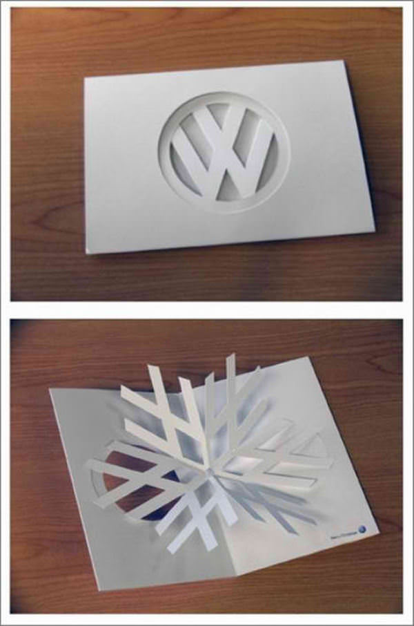
I thought that these three were particularly interesting as they're all cars that have recently been re-designed and released so you can compare these ads with the way they are advertised now.